
In the early 15th century, Johann Gutenberg revolutionized writing through the intention of the printing press. Because of the printing press, scribal books no longer had to be written by hand and could be mass produced, which resulted in an increasingly smarter world of educated people. Below is an image of Gutenberg's font.

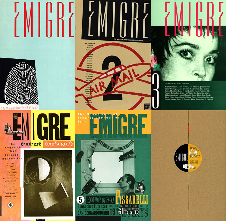
In the early 1900s, designers began to get a bit more creative with their fonts. Just looking at the fonts they created during that time really seems to reflect the modernist movement that was going on. As technology changed so did fonts. With the 1980s personal computers alongside with low resolution printers made typeface easily reachable to a large audience. Emigre Magazine was created in the 1980s and was all about different fonts. Pretty amazing a whole magazine could be dedicated to fonts.
Ligatures, stems, serifs, san-serifs, and more are all different elements that set fonts apart from other fonts. I've never looked at a font and really thought about exactly what makes it different from other fonts but there are really so many elements that come together to make each font slightly or dramatically different from another.
In my English 332 class we watched a documentary called Helvetica, which was all about the font Helvetica. Up until that movie I'd never noticed how prevalent the font really is. It's on teeshirts, coffee mugs, street signs and so much more. Since watching that I've been really noticing how often I see Helvetica or slight variations of it in my daily life.

I think it is really interesting that you pointed out how the evolution of typeface mirrors the evolution of technology. It is almost as if a typeface was crafted for each necessity, from the printing press up through the modern day computers and software. I also liked the examples that you gave with The Little Mermaid posters and the Émigré magazine covers because it really makes us think about something we don’t usually think about. What if there was only one typeface that had to serve every single purpose? Nothing would ever stand out, and in some instances, typefaces would seem awkward and inappropriate. However, once you mentioned the Helvetica typeface and how it is used for some many different things, it makes me wonder if the only reason we would find so many different typefaces necessary is because we have gotten used to seeing them in our everyday lives. In fact, typefaces all have such small variations from each other, would we really need the difference if we had never seen them before? Or would everything in one typeface just be “normal”.
ReplyDelete